You would think that we here at Whiteboard Consulting Group, being pretty good (if we do say so ourselves) at Change Management and Transformation, would never have any trouble with change or transformation ourselves.
Not so, actually.
We recently ate a bit of crow and admitted we were a little stubborn when we refused to accept that our logo could use some sprucing up.
First, a Little History
Our website and logo were created early in 2012 by a young up-and-coming designer, and we were (and are still) thrilled with what he did for us. He designed everything from scratch, based only on our rough sketch and (sometimes flip-flopping) requests. The artwork, colours, fonts – everything was very “us” and we loved it!
As our clientele grew and our focus changed, it became clear we needed to spruce up the look and functionality of the website, and this summer we finally bit the bullet to get it done.
A Change is Gonna Do You Good
Enter Kobayashi Online and their creative team. They did an amazing job modernizing our website and adding functionality we didn’t have before. And they also updated our logo.
Here’s the old logo:

Here’s the new one:

You can see the new one is a little more whimsical (which is what we strive for – see Nicole’s blog here on that topic), and looks more like handwriting on a whiteboard. We absolutely love it.
At First We Hated the Idea
Our conversations with Kobayashi’s Art Director, Martin Finesilver, went something like this:
M: You should really let me take a stab at modernizing your logo.
Us: No thanks. We like our logo.
M: I could help make it fit the new site better, make it crisper…
Us: No thanks. It won’t work and we don’t need it.
M: But I…
Us: Look, if you want to try, go ahead. But we won’t like it. We like the one we have.
M: Sigh. Ok.
Fast forward a couple of months, and Kobayashi is sending us concepts. We opened the files with some dread, thinking, what have they done to our logo?
First reaction? “It’s weird.”
Second reaction? “It’s kind of interesting.”
Third reaction? (After really taking the time to look at the site and understand the new design) “It’s pretty awesome.”
The Change Curve
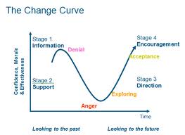
The point of this story is to stress that everyone goes through a series of reactions when going through a major change (or even some minor ones). The Change Curve shows us that a phase of Denial (“It won’t work”) is quickly followed by Anger (“What have they done to our logo”), and then the voice of reason kicks in and Exploration takes over (It’s kind of interesting.”) Finally, Acceptance (“It’s pretty awesome.”)

People who are generally open to change and fairly resilient can go through these phases fairly quickly, zipping right from Disbelief to Acceptance. Others may take a lot longer, and even get stuck in Disbelief or Anger.
The key is to recognize how you (or someone on your team) is handling a change, and to coach accordingly.
Disbelief –>provide information
Anger –> listen more than you talk
Exploration –> encourage and provide more information and opportunities
Acceptance –> reward and recognize
Nicole and I went through these phases relatively quickly because we are fairly resilient (and because we have absolute faith in Brent Kobayashi and his team). We also did a little bit of peer-to-peer coaching when we discussed the new logo, and that always makes things easier.
In the end, it was a great experience, and looking back it was a healthy reminder that we too, go through the change curve. Just like you.
Do you have a change curve experience? Give us a shout via Twitter@whiteboardcons using #betterfastercheaper or email us at info@whiteboardconsulting.ca/staging.
Until next week,
Ruth.

